How to Improve Checkout Experience: A 2026 Guide
Learn how to improve checkout experience for regulated commerce. This guide covers form optimization, compliance messaging, and automated validation.
70.19% of cart additions never turn into purchases, and Baymard's long-running research ties that leakage directly to checkout friction, not just weak traffic quality, with the average large e-commerce site able to increase conversion by 35.26% through better checkout design alone (Baymard's cart abandonment benchmark). For regulated-goods stores, that gap matters twice, because a sloppy checkout doesn't only lose revenue, it also increases the odds of a bad shipment, a blocked order, or a compliance mistake that has to be unwound later. If you want to improve checkout experience in a WooCommerce store, you have to treat conversion and legal safety as the same problem.
The stores that usually struggle aren't broken in one dramatic way. They're slow, cluttered, vague about delivery, and too dependent on humans catching the edge cases after the customer has already clicked pay. That's why the highest-impact fixes are usually boring on the surface, but decisive in practice: fewer unnecessary fields, clearer delivery expectations, better mobile form design, and automated restriction checks before payment.
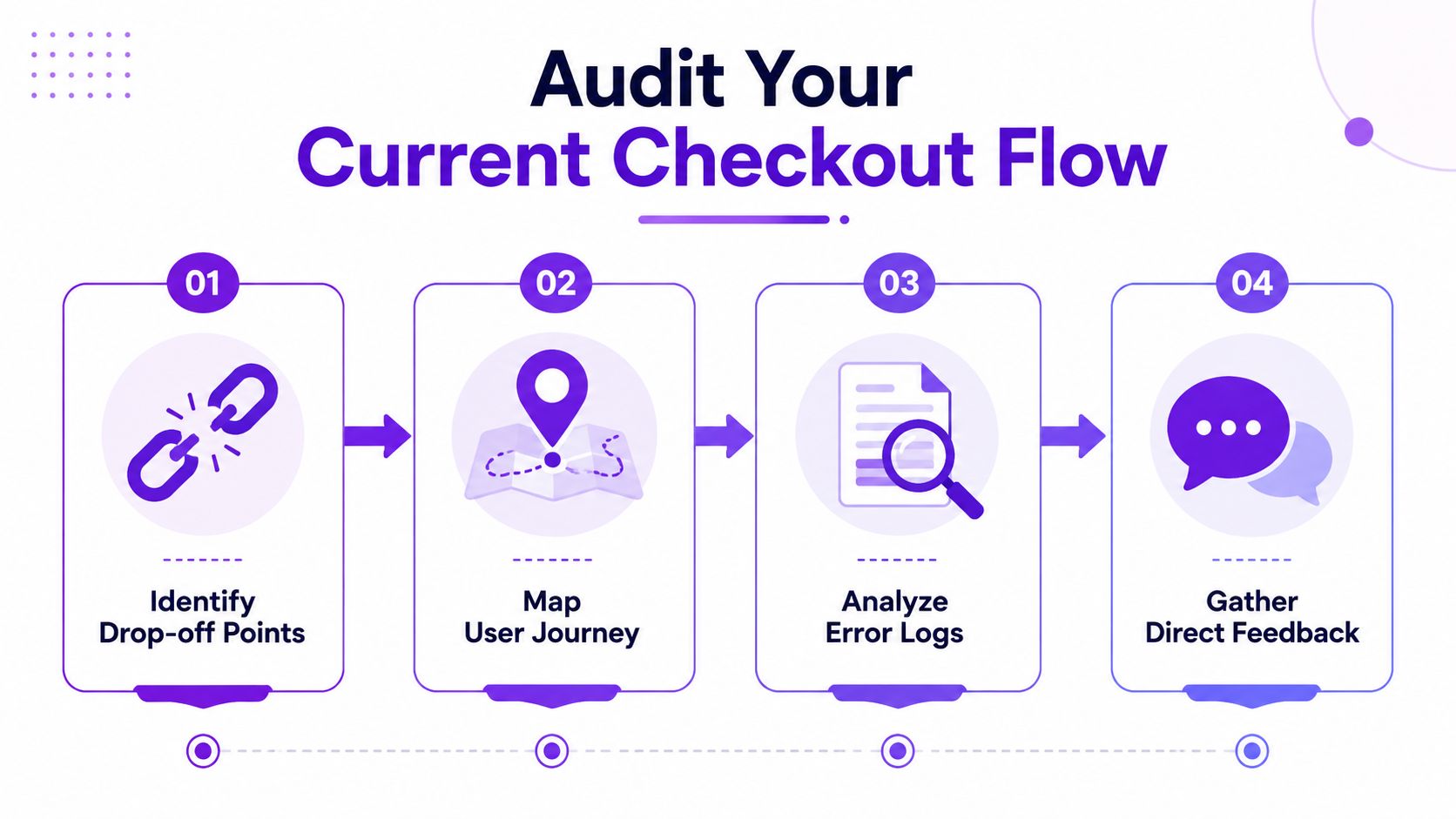
Audit Your Current Checkout Flow
The first thing to check is where the funnel leaks. Baymard's benchmark shows the average checkout flow is 5.1 steps long and includes 11.3 form fields, while many sites only need about 8 fields to finish checkout (Baymard on checkout flow and form fields). That gap is where the audit starts, because every field that does not earn its place adds friction without adding value.
Start with the customer journey, not the settings screen.
Automate Shipping Compliance
Block orders to restricted states automatically. 3-day free trial.
Start Free TrialPull your checkout completion rate from your analytics platform and compare it with the step where customers stop moving forward. If you use Google Analytics or a similar tool, track the funnel from cart to payment submission, then from payment submission to order confirmation. The goal is to identify one of three patterns, a specific field causing drop-off, a shipping step that stalls, or a payment page that loses users right before the finish.
Practical rule: If you cannot point to the exact screen where abandonment rises, you are not ready to redesign anything yet.
A manual review fills in the gaps that reports miss. Run the checkout yourself on desktop and mobile, note every field, every required checkbox, every extra click, and every point where the process forces a customer to stop and think. Then compare that list against what you need to complete the order. A lot of stores carry fields because of old plugin behavior, internal habit, or convenience for staff, not because the customer benefits from them.
For a broader framework on the audit itself, see how Silver Spoon Agency explains it. Their guidance is useful because it keeps the focus on process discipline, not just visual polish.
Build a priority list from evidence
Once you have mapped the journey, review error logs and customer complaints together. If people are abandoning on the same field or shipping choice, that is the first fix. If the issue is broader, like confusion over delivery or account creation, then the problem is structural, not cosmetic.
A clean audit usually ends with three buckets:
- Remove now: Fields or steps that are not required for fulfillment, payment, or compliance.
- Fix next: Validation errors, unclear labels, and confusing shipping copy.
- Monitor later: Smaller layout issues that matter, but are not causing the biggest losses today.
That ranking keeps the team from spending a week polishing a detail while the main bottleneck keeps bleeding revenue. For a WooCommerce store, that kind of discipline matters more than a long list of generic UX ideas. It also creates the right place to add rules like shipping restrictions for one-page checkout when regulated-goods fulfillment needs tighter guardrails without adding unnecessary steps.
Streamline the Checkout Form and User Experience
Checkout forms need to do less, not more. Baymard's research found that many stores still ask for more fields than the order needs, which is a sign that the form is carrying internal preferences instead of customer value. In regulated-goods checkout, that usually means the flow is asking for extra information before it has proven that the information changes fulfillment, billing, or compliance.
Keep the fields that move the order forward
A practical WooCommerce form usually needs the customer's full name, street address, city, state, zip, and email. Everything else should be challenged one by one. If a field does not affect shipping, billing, verification, or a legal requirement, it should be removed from the primary view or tucked behind a clear optional toggle.
Free Shipping Compliance Audit
We'll review your WooCommerce store's shipping compliance for free.
The fields people treat as harmless are usually the easiest to cut. Company name is often irrelevant for a consumer firearm retailer. Address line 2 should stay optional and only appear when the customer needs it. Phone number should be required only when there is a real operational reason for it, and that reason should be clear to the shopper. Confusing required and optional labels still creates hesitation at the point of purchase, especially when the customer is already trying to finish a regulated transaction.
A good before-and-after pattern looks like this:
| Before | After |
|---|---|
| Full address plus company field, secondary address line, phone, account creation prompt | Core shipping fields, email, optional extras tucked away, guest checkout first |
That change is not cosmetic. It cuts the amount of thinking the buyer has to do, and it matters even more on mobile, where each extra field adds friction.
Useful standard: If the field exists only for internal convenience, it does not belong in the primary checkout view.
Reduce account friction without weakening control
The account step deserves special attention. Baymard's checkout UX research shows that many sites still make guest checkout harder to find than it should be, and password rules often add avoidable complexity (Baymard's checkout UX benchmark). That is a self-inflicted problem. If customers can buy without creating an account, the option should be obvious and available without an extra hunt.
For regulated-goods merchants, compliance does not require a bloated form. It requires the right checks in the right place. Sparse customer input plus strict backend validation usually works better than a long front-end questionnaire that feels like a hurdle. If you need to block certain destinations, do it with policy logic and shipping rules, not by making every buyer wade through fields they do not need.
A one-page checkout can still respect those rules if the shipping logic is set up correctly, and shipping restrictions for one-page checkout is the pattern to study when you want to keep the flow tight without loosening controls. If you are unsure which store system is adding avoidable friction, you can also check with AI Website Detector before you start changing the form.
Optimize for Mobile and Page Performance
Mobile checkout failures usually show up as UX complaints, but the root cause is often page performance. A field that feels fine on desktop becomes frustrating when it loads slowly, shifts as the page renders, or forces zooming on a small screen. On mobile, checkout is the main battlefield, and the path has to stay stable while the buyer is entering payment and shipping details.
Make the mobile form easier to finish
Start with the basics. Inputs should use the right HTML types, spacing should work for thumbs, and fields should stack cleanly instead of collapsing into cramped rows. If the buyer has to pinch, zoom, or hunt for the active field, the form is working against itself.
Inline validation matters more on mobile than on desktop because users do not want to discover a mistake after filling out several other fields. Errors that appear only at submission force the customer to backtrack through the whole form, which is avoidable friction. Field-level validation keeps the problem visible while the user still has the context to correct it.
Guest checkout also needs to stay obvious on a phone. As noted earlier, Baymard's research found that many sites still hide the guest path too well and add password rules that create extra work. On a small screen, burying the fastest route costs orders.
Trim the technical weight of the page
Performance work should target the code and services that slow checkout itself. Check checkout scripts, payment widgets, shipping calculators, and any plugin that loads assets sitewide when it only needs to run on the checkout page. Minifying scripts, reducing unused styles, and using browser caching can make the page feel more responsive without changing the design.
If you want a practical list of quick wins for online stores, use it as a working checklist, not a fixed blueprint. Every WooCommerce stack has different bottlenecks, and the fastest gains usually come from the few assets that are doing the most damage.
Shipping-heavy stores also need a caching plan that does not break live rules. Caching strategies for shipping-heavy stores is worth reviewing if your checkout is being slowed by repeated location checks, rate lookups, or restriction logic. The trade-off is straightforward. Cache what can be cached, but keep dynamic shipping and compliance checks accurate so the buyer does not get a fast checkout that misstates what can ship.
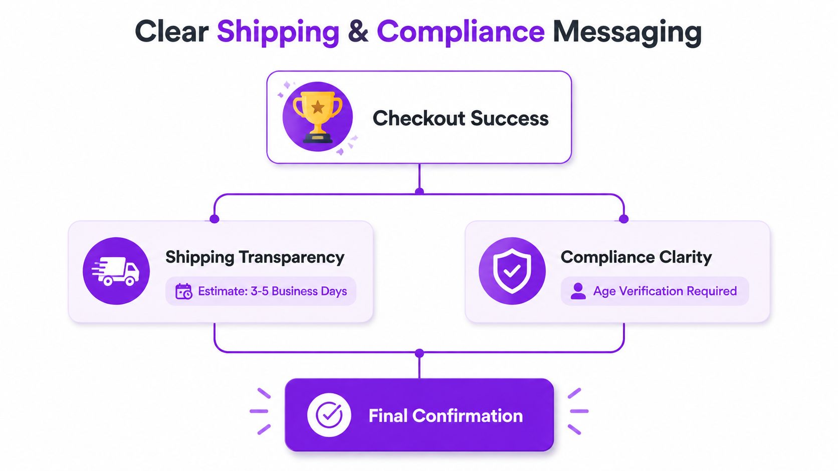
Add Clear Shipping and Compliance Messaging
Shipping copy is conversion copy. Baymard's checkout UX review found that many sites still fail to show a delivery date and a countdown for the cutoff time (Baymard's current checkout UX review). That leaves shoppers guessing, and guesswork is where carts stall. Customers do not only want fast shipping, they want to know exactly what happens next.
Show what the customer actually needs to know
A delivery speed label tells people how long transit might take. A delivery date tells them whether the order will arrive when they need it. That difference looks small on paper, but it changes behavior in checkout. If a buyer is ordering for a specific event or deadline, uncertainty pushes them to pause, compare, or abandon.
For regulated-goods retailers, the message has to do two jobs at once. It needs to set delivery expectations and make restrictions clear before the customer reaches payment. If an order cannot legally ship to a location, the customer should see that early, in plain language, without having to read between the lines. The tone should be direct and professional.
A strong message usually includes:
- Delivery expectation: Use a date or date range, not a vague speed label.
- Cutoff clarity: Show the order window in plain language if same-day or next-day handling matters.
- Restriction notice: Explain that certain destinations or items cannot be shipped before the customer finishes checkout.
- Next step: Tell the customer what happens if the restriction applies, so they are not left guessing.
Clear shipping language lowers anxiety. Confusing shipping language does the opposite, even when the actual policy is reasonable.
Write compliance copy that feels professional
Compliance text does not need to sound severe to be effective. A firearms retailer can say the order is subject to shipping restrictions and verification rules, then tell the customer to complete checkout only if the shipping address is eligible. That gives the shopper the information they need without burying it in legal language nobody reads.
The same principle applies to cutoff-time messaging. Baymard's research shows that many sites still fail to display a countdown, which forces the customer to do the mental math themselves (Baymard's current checkout UX review). If your process depends on timing, state it plainly.
For regulated stores, this is one of the highest-value places to improve checkout experience because the copy protects both sides. Customers know what to expect, and the merchant avoids preventable order issues.
If you want to tighten the address experience as well, a practical next step is address search for restricted shipping rules, especially when checkout needs to catch mismatches before payment.
Automate Address and Shipping Validation
Manual address checks are expensive in time and messy in execution. They also fail at the exact moment a customer expects checkout to be simple. For firearms and other regulated goods, the better pattern is to validate the shipping address automatically before the order reaches payment.
Use restriction rules instead of memory
If you're working in WooCommerce, Ship Restrict is built to check the shipping destination against restriction rules and block checkout when the cart contains items that can't be shipped to that state, city, county, or ZIP code. That kind of automation replaces the “someone in the back office will catch it later” model, which is always slower and riskier.
The setup approach is straightforward. Install the plugin, define your rule structure, and group restrictions by the level your policy requires. Some merchants need state-level blocks. Others need county or ZIP-level logic. The point is to match the rule granularity to the actual compliance burden, not to create one giant list that nobody can maintain.
A practical implementation usually looks like this:
- Define the restricted geography so the rule logic matches your policy.
- Map products to rules if different items carry different restrictions.
- Customize the customer message so blocked orders get a clear explanation.
- Review blocked orders in the dashboard to see what customers are attempting and where friction appears.
That workflow protects the checkout before the payment step. It also makes your team's job simpler because they're not manually correcting problems after the order is already in motion.
Keep the rules current without hand-editing everything
The value of automation shows up when policies change. Scheduled rule updates reduce the chance that a stale ZIP code or outdated restriction list causes a bad shipment. Bulk rule creation also matters when you're dealing with a large rule set, because it cuts the setup burden without requiring a custom script for every change.
For address quality work, Experian Address Search integration guidance is a useful companion reference. It's especially relevant when you want better validation before the address ever becomes an order problem.
The goal isn't to make checkout harder. It's to make it safer and clearer at the same time. When validation happens early and the messaging is direct, customers get a cleaner path, and you get fewer mistakes to clean up later.
Test Changes and Monitor Results
Checkout optimization only works if you measure what changed. Otherwise, you're guessing, and guessing is a good way to break a working flow while trying to fix a different one. The right approach is simple. Track one outcome, change one variable, and watch the funnel closely enough to see what really moved.
Use one metric as the source of truth
Your primary metric should be checkout completion rate, not clicks, not time on page, and not vanity engagement. Secondary metrics can tell you why something changed, but they shouldn't replace the actual purchase outcome. If a redesign shortens the checkout but lowers completion, the redesign failed.
A/B testing is most useful when you isolate one element at a time. Test guest checkout placement, form field count, shipping wording, or validation behavior separately. Don't launch a new layout, new copy, and new payment flow in the same test unless you're prepared to ignore which change caused what. The cleaner the test, the cleaner the decision.
Watch for signals that a fix is helping
The clearest signs usually show up in a few places:
- Fewer exits at a single step: The bottleneck moved, or disappeared.
- Lower validation errors: The form is easier to complete correctly.
- More completed orders on mobile: The page is behaving better where friction used to hurt most.
- Fewer support questions about shipping eligibility: The messaging is doing its job.
Don't trust a prettier checkout if the order count didn't move. Aesthetic improvement isn't the same thing as commercial improvement.
The best teams also keep a rollback threshold in mind before anything goes live. If the test creates more confusion, more blocked orders, or more failed submits, revert quickly. That isn't failure. It's a controlled correction.
Implement Safe Rollbacks and Ongoing Optimization
Checkout changes should be reversible by default. A good WooCommerce workflow uses staging first, documents each change, and keeps a fast path back to the last stable version if something goes sideways. That's especially important when compliance rules, shipping logic, and payment behavior all intersect on the same page.
Build a rollback habit, not just a backup
Before you ship a checkout change, save the current settings, note the plugin version, and record what was altered. If the issue shows up later, you need to know whether the problem came from a layout tweak, a shipping rule update, or a validation setting. Guessing after the fact wastes hours.
Staging environments matter here because checkout bugs often hide until real customers use real devices. A page that looks fine on desktop can fail on mobile, or a restriction rule can block the wrong address format. Test the exact order path your customers use, then push only what survives that test.
Keep the maintenance loop tight:
- Review rules regularly so compliance logic doesn't drift.
- Check page speed so checkout doesn't get heavier over time.
- Audit blocked orders and failures for patterns that suggest a broken rule or unclear message.
- Retest after plugin updates because checkout behavior can change.
The stores that stay healthy don't treat checkout as a one-time redesign. They treat it like a system that needs periodic correction. That mindset keeps small issues from turning into revenue losses or compliance headaches.
If you're trying to improve checkout experience in WooCommerce while keeping regulated orders under control, Ship Restrict gives you a way to automate shipping restriction checks before the order is placed. Visit Ship Restrict if you want to see how rule-based validation, customer messages, and destination blocking fit into a cleaner checkout flow.
Automate Shipping Compliance
Stop worrying about restricted states. Ship Restrict handles it automatically.

Cody Yurk
Founder and Lead Developer of ShipRestrict, helping e-commerce businesses navigate complex shipping regulations for regulated products. Ecommerce store owner turned developer.
Automate Shipping Compliance
- Block restricted states
- No more cancellations
- Set and forget
3-day free trial · Card required