1 Page Checkout
1 page checkout - Implement a 1-page checkout in WooCommerce to boost conversions & ensure compliance. Our 2026 guide covers plugins, design, and testing
Most advice about 1 page checkout is too simple for regulated commerce. It treats speed as the only goal. That works if you sell apparel, supplements, or home goods with straightforward shipping rules. It breaks down when an order can become non-compliant based on state, county, city, or ZIP-level restrictions.
A generic one-page checkout plugin can absolutely make a store feel faster. But if that same checkout lets a customer enter a restricted address, pick a prohibited shipping method, and reach payment before the store verifies legality, the UX win is fake. The merchant pays for it later through manual review, order cancellations, customer frustration, and avoidable compliance risk.
The job isn't shrinking checkout into one screen. It's building a flow that stays fast while verifying all conditions are met prior to payment.
The One-Page Checkout Dilemma for Regulated Products
One-page checkouts get praised for good reason. They often reduce clicks, expose the full process up front, and remove the friction of page transitions. But the standard advice becomes dangerous when it gets repeated as a universal rule.
Automate Shipping Compliance
Block orders to restricted states automatically. 3-day free trial.
Start Free TrialFor regulated products, checkout isn't just a conversion screen. It's a compliance gate. A firearms retailer can't assume every shipping address is valid, every fulfillment method is allowed, or every buyer should see the same options. That means the usual "remove steps and hide complexity" guidance can create the wrong kind of simplicity.
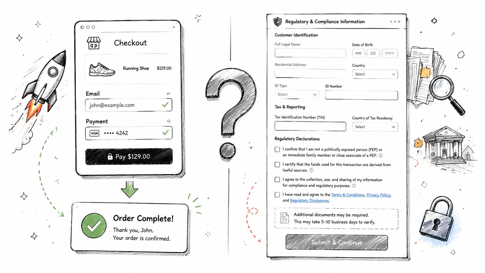
The gap in mainstream guidance is clear. Cloudflight's discussion of one-page checkout notes that existing content overwhelmingly treats one-page checkout as a universal conversion booster but fails to address its critical failure point for regulated goods: automated compliance validation. The same source also highlights the operational pain behind that omission, especially for WooCommerce merchants who otherwise end up doing manual address checks and dealing with shipping mistakes.
Practical rule: If compliance happens after checkout, your checkout isn't optimized. It's just incomplete.
That point matters more than most merchants realize. The usual store can afford some ambiguity until fulfillment. A regulated store often can't. If the team has to review orders by hand after payment, then the checkout has pushed work downstream instead of removing friction.
The better approach is to stop non-compliant orders before they reach the payment stage. That means validating shipping rules early, keeping messages clear, and preventing the shopper from moving forward under false assumptions. A store that wants to block non-compliant orders before checkout in WooCommerce needs to treat restrictions as part of the UX architecture, not as an admin cleanup task.
Choosing Your Implementation Method
The first decision isn't layout. It's how you'll build the checkout.
Most regulated WooCommerce stores choose between two paths. They either install a plugin-based one-page checkout solution and adapt around it, or they build a custom checkout experience with tighter logic and deeper control. Neither path is automatically right. The best choice depends on how often your compliance rules change, how unusual your shipping requirements are, and how much control your team needs over validation order and messaging.
Plugin-based builds
A plugin-based approach is usually faster to launch. You get templates, payment integrations, and a checkout layout without starting from a blank file. For straightforward catalogs, that's often enough.
The problem shows up when the plugin assumes every order follows the same path. Regulated stores rarely do. You may need one product to ship to an FFL, another to allow store pickup only, and another to be blocked based on geography. If the plugin lets the customer reach payment before the store has resolved those conditions, you're forcing compliance to happen too late.
Free Shipping Compliance Audit
We'll review your WooCommerce store's shipping compliance for free.
Plugin-based builds still work when the store's rule set is stable and the checkout plugin exposes enough hooks or filters to control field behavior, shipping logic, and conditional notices. If those controls aren't there, you'll spend more time fighting the plugin than benefiting from it.
Custom development
Custom development gives you control over sequence, logic, and display. That's the main advantage. You can decide exactly when the checkout checks the address, when it updates shipping methods, how it responds to restricted carts, and what message appears to the customer.
That control matters for regulated products because compliance checks can't be treated like cosmetic enhancements. They affect whether the order should proceed at all.
The downside is obvious. Custom work takes more planning, stronger QA, and ongoing maintenance. If your team doesn't have a developer who understands WooCommerce checkout hooks, payment compatibility, and mobile form behavior, the project can drag.
A custom build pays off when your business rules are specific enough that "mostly works" is still a costly failure.
Plugin vs Custom Code for One-Page Checkout
| Factor | Plugin-Based Solution | Custom Development |
|---|---|---|
| Launch speed | Faster to implement if the store can work within the plugin's structure | Slower because the flow, validation, and UI need to be built or heavily tailored |
| Initial cost | Usually lower upfront | Usually higher upfront |
| Flexibility | Limited by the plugin's settings, hooks, and compatibility layer | High control over field order, validation timing, notices, and conditional logic |
| Compliance handling | Works only if the plugin can trigger restriction checks early and block invalid flows cleanly | Better fit when shipping restrictions, fulfillment paths, and cart rules vary by product or location |
| Maintenance | Easier if the vendor keeps pace with WooCommerce and gateway updates | Your team owns testing and regression prevention |
| Performance tuning | Depends on plugin quality and script footprint | Can be tuned around the exact store requirements |
| Agency handoff | Easier for generalist teams to support | Better for specialist teams working in regulated commerce |
How to choose without overengineering
Use a plugin-based route if the checkout logic is still fairly standard and your team needs a faster deployment. Choose custom development if compliance checks must happen in a very specific order or if the shipping and payment logic changes heavily by product type.
A practical test helps. Write down the exact sequence your checkout needs to follow from address entry to payment authorization. If you can't map that sequence cleanly onto an off-the-shelf plugin, custom development is usually the safer move.
Designing a Compliant One-Page Checkout Flow
A compliant one-page checkout works when it feels short without becoming vague. The shopper should understand what to do next, what options are available, and why a restriction exists if one applies. The page can't feel like a legal form, but it also can't pretend regulation doesn't exist.
The structure matters more than the label. A page called "one-page checkout" can still fail if it throws too many fields, too many notices, and too many decisions at the customer all at once.
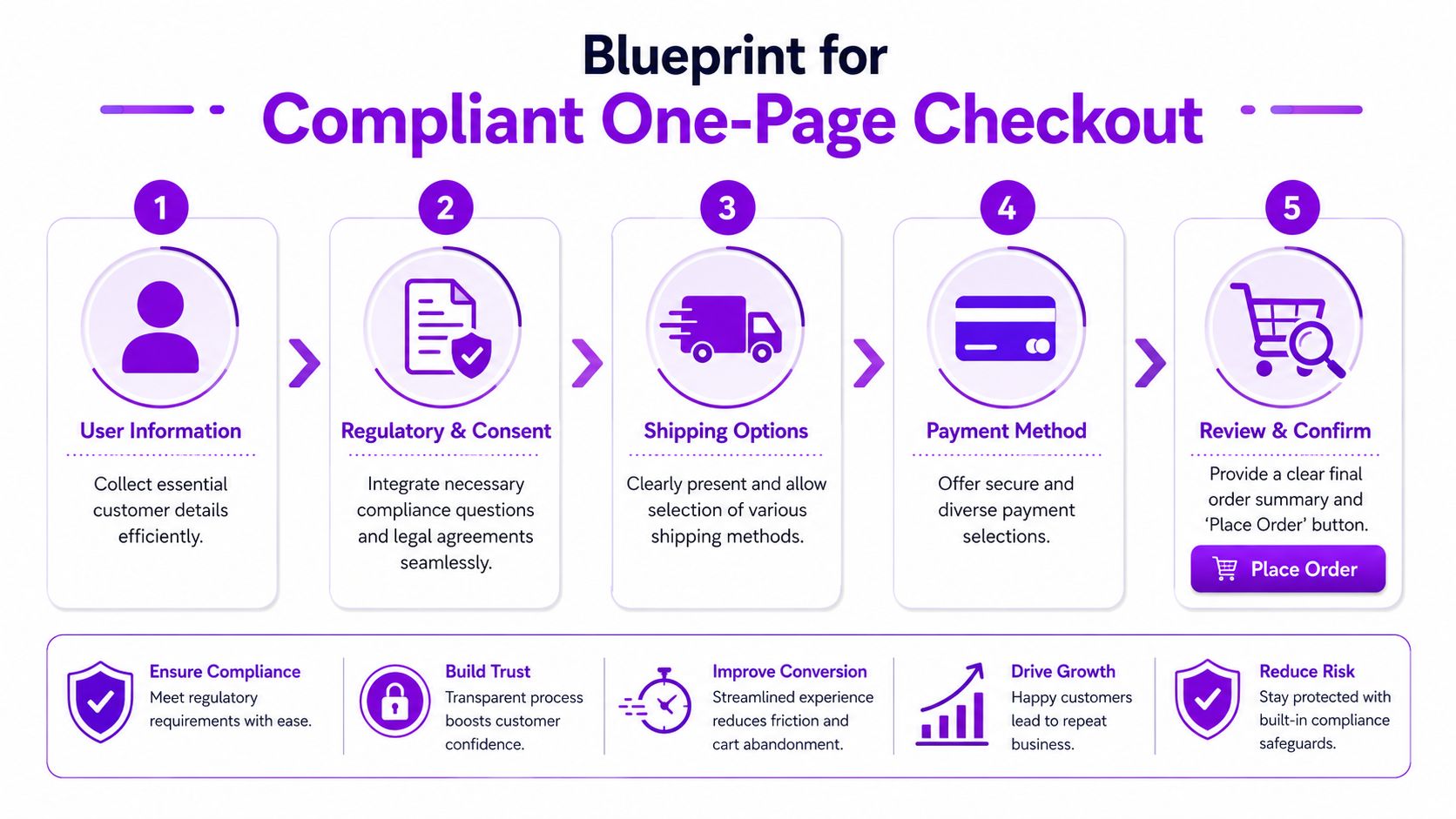
Start with field discipline
The cleanest benchmark for a one-page layout is still worth following. Growth Engines' checkout optimization guidance says the critical technical specification is limiting required form fields to 7 to 8 maximum, which yields a documented 25 to 35% lift in conversion rates. The same source also recommends inline validation and 44px minimum tap targets for mobile, and notes that 55% of shoppers abandon checkout due to poor mobile usability.
That doesn't mean regulated stores can ignore required data. It means you should challenge every field.
Use this standard:
- Keep legally necessary inputs. Name, contact details, shipping address, payment details, and required acknowledgments stay.
- Collapse redundant information. A single full-name field is often cleaner than separate first and last name fields.
- Auto-fill where possible. ZIP-based city and state completion reduces typing and cuts avoidable errors.
- Mirror addresses by default. A billing-same-as-shipping checkbox removes duplicate input unless the customer needs a separate billing address.
Most regulated checkouts don't fail because they ask for too little. They fail because they mix required information with unnecessary form clutter.
Put compliance checks in the middle, not at the end
The biggest design mistake is treating compliance like a final review step. By that point, the customer has already invested effort, chosen payment, and mentally committed to the order.
A stronger flow places validation immediately after the shopper provides enough shipping information for the system to assess legality. In practice, that usually means checking restrictions as soon as the relevant address fields are complete, then updating the page without a reload.
That lets the checkout do three important things:
- Block prohibited orders early
- Adjust available shipping methods based on the destination
- Explain the restriction before the customer reaches payment
If a customer learns about a restriction after entering card details, the checkout created frustration instead of reducing it.
Group content by decision, not by backend system
One-page checkout designs often become messy because the developer groups fields based on database logic rather than user flow. The customer doesn't care which plugin owns a field. The customer cares about getting through the page without confusion.
A practical grouping model looks like this:
Contact and destination
This area should collect only the information needed to identify the buyer and evaluate the shipping destination. Keep it compact. Let the shopper move fast.
For regulated goods, this is also where the checkout should internally prepare for restriction checks. The customer doesn't need to see technical complexity. They need responsive feedback and clear language if something isn't allowed.
Regulatory consent
This section should be short and specific. Don't dump policy text into a giant checkbox area. Ask only for confirmations that matter to the transaction.
If a product category requires acknowledgment, keep the language plain. If a product requires a special fulfillment path, explain it next to the relevant choice instead of hiding it in a footer notice.
Shipping and fulfillment
Regulated stores require extra care. Show only valid fulfillment methods for the destination and cart contents. If an option isn't available, don't force the customer to discover that by trial and error.
For example, if the cart requires dealer transfer or store pickup, the checkout should present that as the natural path. The customer shouldn't have to decode a generic "shipping unavailable" error.
Payment and review
Payment belongs late in the layout, but only after the page has resolved shipping legality and available methods. Keep the order review visible and stable so the customer can confirm what they're buying without hunting through the page.
Keep the page calm
One-page doesn't mean everything should scream for attention at once. Use spacing, field grouping, short labels, and restrained messaging. Compliance language should be visible when relevant, not pasted across the full page like a warning banner.
A good regulated checkout feels ordinary to eligible buyers and precise when a rule applies. That's the standard.
Streamlining Payments and Shipping Options
Payments and shipping are where a one-page layout gets crowded fast. That's even more true in regulated commerce, where the shipping choice may carry legal implications and the payment method may need restrictions of its own.
The fix isn't to add more explanatory text. It's to reduce the number of choices each customer sees at one time.
Shipping choices should reflect the cart and destination
A one-page checkout works best when the shipping section behaves like a filtered decision tree. The customer enters a destination, the checkout evaluates the cart, and then the page displays only the fulfillment paths that are valid.
That keeps the page aligned with the core advantage of one-page design. DigiSmoothie's analysis of one-page versus multi-page checkout states that one-page checkout designs convert approximately 7.5% more shoppers and reduce cart abandonment by an average of 20%, largely because consolidating the process minimizes clicks and friction. Regulated stores only get that benefit if the page removes invalid choices instead of forcing the shopper to sort through them.
For firearms and similar categories, that means thinking beyond "Standard" and "Express." The store may need options such as transfer-based fulfillment, in-store pickup, or no eligible shipping path at all. The customer experience improves when the page is explicit.
Use shipping labels that answer the customer's real question:
- Dealer transfer required instead of a vague carrier label
- In-store pickup available for this order when pickup is permitted
- Shipping unavailable for this destination when the cart can't legally ship there
Keep payment options visible but controlled
Payment should feel simple, even when the store supports multiple gateways. Show the available methods clearly, but don't make the customer scan through a cluttered stack of logos, terms, and expandable boxes.
A few practical rules help:
- Show the default recommended method first if one path is best for most orders.
- Use short trust copy near payment fields instead of pushing reassurance into banners.
- Hide irrelevant methods when a product, destination, or compliance rule makes them unusable.
For regulated products, payment logic may also need restrictions. Some gateways aren't appropriate for certain item categories or transaction scenarios. If you're working through those conditions in WooCommerce, this guide to payment gateway restrictions for regulated products in WooCommerce is worth reviewing before you finalize the checkout layout.
Checkout advice: Don't make customers interpret your operations. Translate legal and payment complexity into a short list of valid choices.
Trust belongs near action
A one-page layout removes the comfort of separate steps, so the page needs reassurance in the right places. Put policy links, security signals, and fulfillment notes close to the points where the customer hesitates. Near shipping selection, explain what happens next. Near payment, reinforce that the transaction is secure and the order details are reviewable.
What doesn't work is stuffing the page with every badge, icon, and policy excerpt the business has. That increases density and weakens the signal.
Optimizing for Performance and Mobile Experience
A one-page checkout can lose its advantage the moment it becomes heavy. The page only feels faster if it loads quickly, responds quickly, and validates without freezing the screen.

Performance matters more in regulated commerce because the page often runs extra logic. It may need to assess destination restrictions, adjust shipping methods, display conditional notices, and account for product-specific fulfillment rules. If all of that runs in a blocking sequence, the shopper experiences lag exactly when confidence needs to stay high.
Speed first, then sophistication
The baseline rule is simple. Checkout Page's conversion benchmark article says a 1-second delay in page load time reduces conversions by 7% to 20%, while a 0.1-second speed improvement can lift conversions by 8.4%. The same source notes that one-page checkouts generally load faster by reducing server requests.
For regulated stores, the takeaway isn't "avoid validation." It's "implement validation without turning the page into a bottleneck."
That usually means:
- Load core checkout UI first so the customer can begin entering data immediately.
- Run restriction checks asynchronously once the page has enough address information.
- Avoid full page reloads when shipping methods or notices change.
- Keep third-party scripts under control because every extra widget competes with the checkout's primary job.
The page should always feel responsive, even when it's doing more under the hood than a standard store.
Mobile is where weak checkouts get exposed
Desktop can hide a lot of sins. Mobile doesn't.
A regulated one-page checkout on mobile should use one clear column, generous spacing, and touch targets that don't punish the user for having a thumb instead of a mouse. Field formatting also matters. Numeric inputs should call the right keyboard. Card fields should auto-format cleanly. Error messages should appear inline, close to the field that needs attention.
The hardest mobile problem in regulated checkout is scroll fatigue. If the page stacks contact info, compliance language, shipping rules, payment options, and a large order summary with no hierarchy, the customer loses orientation.
Use a few strong patterns:
Keep summaries collapsible
Let customers expand the order summary when they need it. Don't make them scroll past a long cart recap every time they return to the form.
Trigger validation at sensible moments
Check the address when the destination is complete enough to produce a reliable result. Don't fire heavy logic on every keystroke.
Preserve context when restrictions appear
If the system blocks a shipping path or changes the available methods, the message should appear next to the affected section. For stores dealing with mobile-specific compliance concerns, this article on mobile commerce and shipping restrictions across devices is a useful reference point.
A short visual walkthrough helps when teams are reviewing mobile friction points before launch:
<iframe width="100%" style="aspect-ratio: 16 / 9;" src="https://www.youtube.com/embed/3RS0wvRxVW8" frameborder="0" allow="autoplay; encrypted-media" allowfullscreen></iframe>Performance testing should reflect real use
Don't test only on a developer laptop and a perfect connection. Test the checkout on an actual phone, on ordinary mobile bandwidth, with realistic cart combinations and restricted destinations. A one-page layout can appear polished in staging and still fail under real conditions when dynamic shipping logic starts firing.
The standard is simple. The page must stay fast enough that compliance checks feel integrated, not bolted on.
Measuring Success and Final Audits
A compliant checkout isn't successful because it looks cleaner. It's successful if it increases completed valid orders and reduces avoidable operational work.
That means launch isn't the finish line. You need a measurement plan and a blunt audit process.
Use the right metric
If you change checkout structure, the main KPI is checkout completion rate. Zuko's analysis of Shopify one-page versus multiple-step checkout says switching to a one-page checkout can improve completion rates by 5 to 7%, but only if you track the right metric. The same source also warns that a critical pitfall is failing to offer guest checkout by default, and notes that enabling guest checkout as the default can generate a 20 to 45% lift in conversion.
For regulated stores, that metric needs context. A higher completion rate doesn't mean much if the checkout also increases bad orders, manual reviews, or support tickets caused by unclear restriction messaging.
Track the operational signals alongside conversion:
- Completion rate by device so mobile problems don't hide inside blended averages
- Error frequency by field or section to spot where shoppers get stuck
- Restriction-trigger events to see whether rules are firing clearly and early
- Payment-stage exits to identify whether trust or gateway presentation is the issue
- Manual intervention volume because one of the goals is reducing backend cleanup
Audit what customers actually experience
A one-page checkout in regulated commerce should be tested like a workflow, not just a template.
Run through these scenarios:
- A valid order with standard behavior from address entry through payment
- A restricted destination that should be blocked before payment
- A cart with alternative fulfillment requirements such as pickup or transfer-based delivery
- A guest checkout session to confirm the fastest path is available
- A mobile session where address validation, shipping updates, and payment entry happen on a smaller screen
The audit question isn't "Does checkout function?" It's "Does checkout guide the right customer forward and stop the wrong order early enough?"
Use A/B testing carefully
If you still have a multi-step checkout, compare it against the one-page version in a controlled test. Segment results by device and, where possible, by order type. Regulated stores often discover that one flow works better for straightforward carts while another performs better when compliance messaging becomes more prominent.
The winning version is the one that balances conversion, clarity, and legal safety. In regulated eCommerce, a checkout that converts slightly less but prevents bad orders earlier can still be the stronger business system.
If your WooCommerce store sells regulated products and you're tired of manual address checks, avoidable cancellations, and checkout flows that ignore shipping rules, take a look at Ship Restrict. It helps merchants automate shipping compliance before an order becomes a problem, with granular restriction rules built for regulated commerce.
Automate Shipping Compliance
Stop worrying about restricted states. Ship Restrict handles it automatically.

Cody Yurk
Founder and Lead Developer of ShipRestrict, helping e-commerce businesses navigate complex shipping regulations for regulated products. Ecommerce store owner turned developer.
Automate Shipping Compliance
- Block restricted states
- No more cancellations
- Set and forget
3-day free trial · Card required