Check Out Buttons: Optimize WooCommerce Checkout Buttons
Check out buttons - Master WooCommerce checkout buttons. Design, implement, & test for higher conversions & compliance with Ship Restrict examples. Optimize
Cody Y.
Updated on Jun 18, 2026
You've probably seen this happen. A customer adds a restricted item, enters a shipping address, reaches checkout, and only then does your store reveal that the order can't legally ship. If your checkout button still says Place order and stays active until the last second, you're not just creating friction. You're inviting chargebacks, support tickets, failed authorizations, and avoidable compliance exposure.
That's why I don't treat check out buttons as decorative UI. In WooCommerce, the checkout button is the final control point in the purchase flow. For stores selling regulated goods, that control point needs to do two jobs at once. It should help legitimate buyers complete checkout with confidence, and it should stop non-compliant orders before they become operational problems.
Why Your Checkout Button Is More Than Just a Button
A lot of stores still treat the checkout button like a fixed label at the bottom of a form. That approach works if every product can ship everywhere and every order follows the same rules. It breaks down fast when your catalog includes ammunition, firearm accessories, age-restricted products, hazmat items, or anything else with location-based restrictions.
The button is where customer intent becomes a transaction. That makes it one of the most sensitive parts of the entire storefront.
Automate Shipping Compliance
Block orders to restricted states automatically. 3-day free trial.
Start Free TrialFriction and risk meet in the same place
A Visa-cited study summarized by Fintech Across the Pond's checkout button analysis found that shoppers complete an average of 23 information fields during online checkout, taking about 2 minutes, and that buy buttons can reduce checkout time by nearly 40%. That matters because long checkout flows create drop-off, but they also hide compliance problems until the very end if your rules aren't surfaced clearly.
For regulated WooCommerce builds, I want the button to communicate state, not just action. Sometimes that means:
- Allowing checkout normally when the cart and address pass your rules
- Changing the button text when more verification is required
- Disabling submission when the order can't ship legally
- Showing a specific reason instead of a generic validation error
Customers don't mind rules as much as they mind surprises. If the button says one thing and the business logic says another, the store feels unreliable.
Practical rule: If a customer can click the final button but can't legally receive the order, your checkout logic is too late.
A smart button reduces ambiguity
The best check out buttons aren't always the most aggressive. They're the clearest. A buyer who sees “Place order” assumes the store is ready to accept the order as configured. If the answer is “only after address review” or “not for this ZIP code,” your button should reflect that before payment submission.
That's also where customer psychology matters. The frustration behind abandonment usually isn't one big event. It's a stack of small uncertainties, delays, and trust breaks. Quikly's piece on the psychology of shopping cart abandonment is useful here because it frames abandonment as a reaction to friction and hesitation, not just price sensitivity.
Static buttons are a missed opportunity
In WooCommerce, a static button wastes a valuable decision point. You can use that same control to:
| Button state | What it signals | Best use case |
|---|---|---|
| Enabled with direct CTA | Order is valid and ready | Standard compliant checkout |
| Enabled with revised text | Extra step ahead | Payment authorization, age check, document upload |
| Disabled with message | Order blocked for a clear reason | Restricted geography, prohibited combination, shipping-rule conflict |
That's the shift. The checkout button isn't only a conversion element. It's a policy enforcement surface. Stores that understand that tend to create fewer bad orders and fewer bad surprises.
Designing Checkout Buttons That Convert and Clarify
Most button advice is shallow. Make it bigger. Use a contrasting color. Add urgency. None of that fixes a checkout flow that gives mixed signals.
Free Shipping Compliance Audit
We'll review your WooCommerce store's shipping compliance for free.
Baymard's 2025 research found that 64% of leading US and European ecommerce sites had a “mediocre” or worse checkout UX score, while only 2% were rated “good,” according to Baymard's current state of checkout UX report. Their findings line up with what shows up in WooCommerce audits all the time: weak button hierarchy, vague labels, unclear guest paths, and error handling that makes the main action feel unsafe.
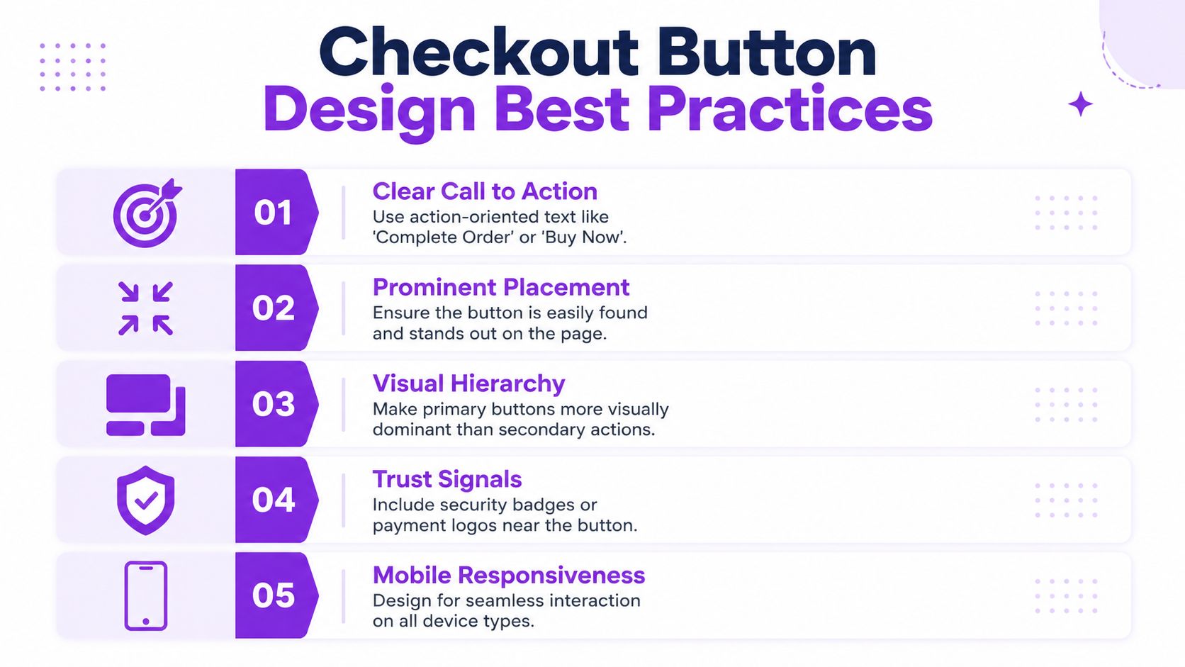
Use button text that matches the real outcome
If clicking the button submits payment immediately, Place order is fine. If it opens a hosted wallet, triggers a quote request, or starts a review workflow, that label is wrong.
I usually make this decision with one simple question: what does the customer think happens next?
Good examples:
- Proceed to payment when the next step is gateway selection or wallet authorization
- Submit for review when compliance staff must verify the order
- Complete order when the transaction is final and straightforward
Bad examples:
- Continue because it says nothing
- Buy now at standard checkout when payment isn't immediate
- Apply for fields that should update automatically
That last one matters. Baymard's usability guidance has long pointed out that inline “Apply” buttons in checkout often create confusion when users expect the page to update on its own. The same principle applies to your main CTA. If people have to stop and interpret the button, you've already lost momentum.
Build a clean action hierarchy
A modern WooCommerce checkout often includes more than one path: the standard checkout button, PayPal, Apple Pay, Google Pay, and accelerated options injected by themes or payment plugins. That can help completion, but it can also turn the most important decision point into a visual argument.
Use one primary action. Everything else should support it, not compete with it.
A practical layout looks like this:
- Primary button first when your store requires rule validation, shipping checks, or product-specific conditions
- Express options grouped together so they read as alternatives, not rivals
- Supporting trust copy nearby such as shipping restrictions, age requirements, or payment timing
When I audit stores with low checkout clarity, the problem often isn't that they lack buttons. It's that they have too many “main” buttons.
The button that carries legal responsibility should also carry visual priority.
For teams refining those details, this guide to designing effective micro interactions is worth reading. Button hover states, inline feedback, and disabled-state messaging often decide whether a checkout feels controlled or fragile.
Don't let express buttons outrank compliance messaging
Express checkout is useful. It's also dangerous when it bypasses context the buyer needs to see. If your products have shipping restrictions, age checks, or destination rules, don't bury those constraints under a row of branded wallet buttons.
Use a quick review checklist:
- Keep the primary CTA visually dominant if eligibility must be confirmed before payment
- Place restriction messaging above the fold when geography or product category affects fulfillment
- Avoid styling every payment option as equal unless they follow the same business rules
- Test on mobile first because stacked buttons can push critical messages below the visible area
If you need examples of persuasive language structure, even outside checkout, sample sales letter patterns for product messaging can be a useful reference for tightening copy around action and clarity.
Customizing WooCommerce Checkout Buttons with Code
If you want real control over check out buttons in WooCommerce, start with code, not page-builder toggles. Theme settings usually cover color and spacing. They rarely handle the logic that matters, like conditionally changing text, injecting warnings, or blocking submission safely.
For anything tied to business rules, put the code in a small site-specific plugin. Don't bury it in functions.php if the behavior is business-critical. Theme changes shouldn't alter compliance behavior.
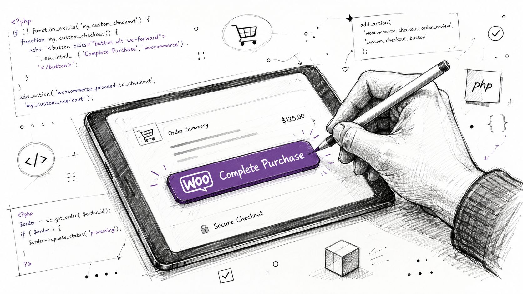
Change the order button text
WooCommerce gives you a direct filter for the checkout submit label.
add_filter( 'woocommerce_order_button_text', function( $text ) {
	if ( WC()->cart && ! WC()->cart->is_empty() ) {
		foreach ( WC()->cart->get_cart() as $cart_item ) {
			$product = $cart_item['data'];

			if ( has_term( 'ffl-required', 'product_cat', $product->get_id() ) ) {
				return 'Submit for Compliance Review';
			}
		}
	}

	return 'Place Order';
} );
This is useful when the order path changes based on cart contents. The customer gets a more accurate expectation before they click.
Add custom wrapper markup around the button
If you need to add explanatory text, a notice block, or custom classes around the button, filter the full button HTML.
add_filter( 'woocommerce_order_button_html', function( $button_html ) {
	$message = '<p class="checkout-policy-note">By placing this order, you confirm the shipping destination is eligible for the items in your cart.</p>';

	return '<div class="custom-checkout-action">' . $message . $button_html . '</div>';
} );
Then style it:
.custom-checkout-action {
	margin-top: 1.5rem;
}

.checkout-policy-note {
	margin-bottom: 0.75rem;
	font-size: 0.95rem;
	color: #4b5563;
}

.woocommerce #payment #place_order {
	background: #111827;
	border-radius: 6px;
	padding: 0.9rem 1.25rem;
	font-weight: 600;
}

.woocommerce #payment #place_order:disabled,
.woocommerce #payment #place_order.disabled {
	opacity: 0.5;
	cursor: not-allowed;
}
This pattern is better than hacking template files when all you need is controlled messaging and styling.
Block checkout with a real validation rule
Changing text is cosmetic. Validation is where the button becomes operational.
Use woocommerce_after_checkout_validation if you need to reject an order based on address, product mix, or customer input.
add_action( 'woocommerce_after_checkout_validation', function( $data, $errors ) {
	if ( empty( $data['shipping_state'] ) ) {
		return;
	}

	$restricted_states = array( 'CA', 'NY' );

	$has_restricted_item = false;

	foreach ( WC()->cart->get_cart() as $cart_item ) {
		$product = $cart_item['data'];

		if ( has_term( 'restricted-item', 'product_cat', $product->get_id() ) ) {
			$has_restricted_item = true;
			break;
		}
	}

	if ( $has_restricted_item && in_array( $data['shipping_state'], $restricted_states, true ) ) {
		$errors->add(
			'restricted_shipping',
			'This item cannot be shipped to the selected destination. Please remove the restricted product or use an eligible shipping address.'
		);
	}
}, 10, 2 );
That keeps the logic server-side, where it belongs. Front-end disabling alone isn't enough because users can still manipulate the browser.
For a broader implementation walkthrough, Divi Mode's guide to WooCommerce checkout customization is a practical reference, especially if you're balancing code changes with theme-level layout edits.
A quick visual walkthrough helps if you're handing this off to another developer or store manager:
<iframe width="100%" style="aspect-ratio: 16 / 9;" src="https://www.youtube.com/embed/Nnx-P1j8QKI" frameborder="0" allow="autoplay; encrypted-media" allowfullscreen></iframe>Choose maintainability over speed
If the button logic affects fulfillment, taxes, shipping eligibility, or legal acceptance, treat it like application logic.
Use this rule of thumb:
| Where to put it | Good for | Avoid when |
|---|---|---|
Theme functions.php | Small visual tweaks tied to one theme | The rule must survive theme changes |
| Site-specific plugin | Validation, button states, compliance rules | You need non-technical admins to manage logic |
| Template override | Structural checkout markup changes | A filter already exists for the same job |
That's the difference between a custom checkout and a brittle one.
Building Smart Checkout Buttons with Ship Restrict
The stores that struggle most with compliance usually have the same symptom at checkout. The system allows the customer to keep moving, then throws a vague error too late. The buyer thinks the site is broken. The merchant gets a support request. Operations ends up manually untangling an order that never should've reached payment.
A smarter button strategy starts earlier. The moment the cart, destination, and restriction rules conflict, the checkout action should reflect that state clearly.
What this looks like in practice
Take a common scenario. A customer adds a restricted product and enters a shipping ZIP code that your business rules reject. A weak implementation waits until order submission, then returns a generic notice. A stronger implementation changes the checkout state before the final click becomes possible.
That means the customer sees three things working together:
- A disabled or intercepted primary button
- A plain-language reason
- A path forward, such as removing the restricted item or changing the address
That combination matters. If you only disable the button without explanation, the experience feels broken. If you only show a notice but leave the button active, people keep trying and create noise.
If a restriction exists, the button should confirm it, not contradict it.
The button state should match the shipping rule
For regulated catalogs, I usually think in terms of button-state mapping.
| Shipping condition | Recommended button behavior | Customer message |
|---|---|---|
| Order is valid | Enable standard checkout | No extra message needed |
| Order needs review | Change CTA text | Explain that fulfillment depends on verification |
| Order is prohibited | Disable or block submission | State which shipping rule is preventing checkout |
The key is consistency. If your store says “Proceed” while your rule engine says “No,” customers lose trust fast.
Helpful messaging beats generic failure
Most compliance friction gets worse because the message is too abstract. “There was an error processing your order” doesn't help anyone. It doesn't help the customer fix the cart, and it doesn't help your team avoid repeat tickets.
Use direct language instead:
- This product can't ship to the selected ZIP code
- One or more items in your cart are restricted for this destination
- Update the shipping address or remove the restricted item to continue
These messages don't need legalese. They need precision. The goal is to stop the wrong order while preserving confidence for the right one.
Pair logic with visible feedback
There's an important implementation detail here. Restriction engines should influence both validation and presentation.
A good workflow looks like this:
- Check eligibility before payment submission
- Reflect that result in the button state
- Display the reason near the action area
- Re-check server-side during checkout validation
That last step is essential. Front-end clarity helps users. Server-side enforcement protects the store.
For developers building more complex destination rules, the Ship Restrict use case documentation is a useful reference because it shows how merchants handle state, county, city, and ZIP-based shipping restrictions in real WooCommerce workflows.
One practical pattern for WooCommerce stores
When I build this type of flow, I don't start with custom JavaScript. I start with the business rule itself.
Ask these questions first:
- What combination triggers a block. Product category, shipping method, state, ZIP, customer role?
- What should the button do. Change text, disable, or remain active with a warning?
- What should the user do next. Remove item, change destination, or contact support?
Once those answers are clear, the button becomes easy to design. It isn't “optimized” in the generic CRO sense. It's accurate.
That's the core value of smart check out buttons in regulated ecommerce. They don't just increase the chance of a completed order. They increase the chance that the completed order is one you can legally and operationally fulfill.
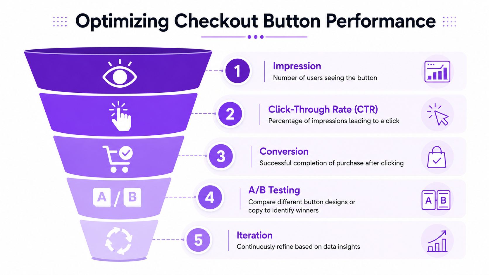
How to Measure and Test Checkout Button Performance
Checkout changes need proof. A button that looks cleaner or feels more compliant isn't automatically better. The only reliable test is whether more valid orders complete with less friction and fewer rule conflicts.
Stripe recommends tracking the buy-button click-through rate, the ratio of add-to-cart to purchase completion, and device-level performance to isolate friction points, as outlined in Stripe's buy button optimization guide. That's the right starting point because checkout sits at the narrowest point in the funnel. Small changes there can have outsized effects, but only if you measure the right thing.
Measure outcomes, not button vanity
A common mistake is declaring success because more people clicked the button. That's not enough. An aggressive label or brighter style can increase clicks while reducing completed purchases if it creates confusion later.
Track a sequence instead:
- Button visibility through scroll depth or placement checks
- Click-through to checkout action
- Completion rate after click
- Drop-off by device
- Validation errors tied to rule conflicts
If you're wiring this into analytics, this walkthrough on tracking checkout behavior in Google Analytics is useful for structuring event-level visibility without guessing where users are failing.
Testing note: Judge a checkout button by completed purchases and resolved friction, not by clicks alone.
A useful A/B framework for regulated stores
For compliance-sensitive WooCommerce stores, test one meaningful variable at a time. Don't change button text, placement, validation wording, and wallet visibility all at once.
Good tests include:
| Test | What changes | What to watch |
|---|---|---|
| CTA text | “Place Order” vs “Submit for Review” | Completion quality, support confusion |
| Restriction message position | Above button vs inline notice | Validation retries, abandonment pattern |
| Express payment visibility | Shown prominently vs visually secondary | Device performance, completion after click |
The best-performing variant isn't always the one with the most aggressive completion path. In regulated ecommerce, a “win” can also mean fewer invalid attempts and fewer customer service loops.
Segment before you conclude
Always break results down by context:
- Mobile vs desktop
- New vs returning customers
- Restricted-product carts vs standard carts
- Wallet users vs standard checkout users
That's where button problems usually reveal themselves. A version that works on desktop can fail on mobile because warning text drops below the fold. A label that helps regulated-item buyers may slow down standard orders if you apply it globally.
The fix is usually simple. Narrow the rule, narrow the audience, and test again.
Your Next Steps for a Smarter Checkout
The best check out buttons do more than move the sale forward. They confirm that the sale should move forward. That distinction matters in WooCommerce, and it matters even more when the products in your cart carry shipping restrictions, age requirements, or destination-based limitations.
A good checkout button is clear. A better one is context-aware. The strongest version combines clear copy, strong visual hierarchy, server-side validation, and visible feedback when business rules block the order.
If you're auditing your store this week, start with the final button and work backward. Ask whether the action text matches the actual next step. Check whether express payments are competing with your main path. Review whether invalid orders are being stopped early enough. Then look at how customers are told what went wrong and what to do next.
Use this checklist:
- Audit button language so the CTA matches the checkout outcome
- Review visual hierarchy so one primary action clearly leads the page
- Move compliance messaging closer to the final action area
- Add server-side validation for restricted products and destinations
- Test button states for valid, review-required, and blocked orders
- Track completions and drop-off instead of judging by clicks alone
- Segment results by device, cart type, and payment path
That's how you turn a passive checkout button into an active control surface. Not louder. Smarter.
If your WooCommerce store sells regulated products, Ship Restrict gives you a practical way to enforce shipping rules before bad orders reach fulfillment. It's built for merchants who need location-based restrictions, clear customer messaging, and fewer manual compliance checks at checkout.
Automate Shipping Compliance
Stop worrying about restricted states. Ship Restrict handles it automatically.

Cody Yurk
Founder and Lead Developer of ShipRestrict, helping e-commerce businesses navigate complex shipping regulations for regulated products. Ecommerce store owner turned developer.
Automate Shipping Compliance
- Block restricted states
- No more cancellations
- Set and forget
3-day free trial · Card required